


As email marketers, one of the biggest challenges we face is harnessing our audience’s interests in a way that entices them to act. While structure, design and content are all essential elements within your email, they are most powerful when used to complement and enhance the most important element – your call to action (CTA).
Here are some helpful tips about how to create a clear and strong call to action.
1. Identify your objective and plan around it
Be clear on exactly what you want your recipients to do when they read your email. Would you like them to register for an event, purchase a product, read an article, enter a competition or claim an offer?
Try not to complicate your email with multiple calls to action. Decide on your single most important call to action and then design your email to complement and draw attention to it.
For example, if your objective is to encourage new subscribers to make a purchase, include compelling copy that provides your recipients with an offer of free shipping, an good image of your products and a call to action that emphasises how easy it is to claim the offer.

This email is clear and straight forward with a simple “click here” call to action. They also say thanks and give their subscribers an offer right up front. Very nice!
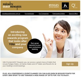
2. Give your call to action the best seat in the house
A good rule of thumb is to keep your call to action ‘above the fold’ in the first 400 pixels of your email. This is the best real estate in your email and is where your call to action will have maximum exposure.

This email has a large clickable area at the top which says “$50 Birthday gift voucher*” which immediately informs the audience of the email’s purpose. Coupled with the nice holiday images and text below, this call to action is very effective.
3. Make the most important thing the most important thing
Try to limit each email to only one call to action. Otherwise people may get confused with what you’re asking them to do. This doesn’t mean you can’t include the same call to action in your email in a few different ways such as images, buttons and in-text links. In fact, it’s a good idea to pepper your call to action throughout the email to increase the chances of it being noticed.
This email is very single minded in its approach and has a single call to action to enter a competition. It emphasises the benefit of entering the competition several times and includes both image and text links for the call to action.

4. Keep it clean
Make your call to action stand out from everything else in your email. Surround your call to action with white space, include buttons, add exciting images and use contrasting colours. A clever and artistic design is all well and good; however it’s not going to increase the effectiveness of your email if the call to action is neglected. With the increasing number of people who check their emails using mobile devices it’s also important to remember that small calls to action can be hard to select on a smartphone’s touch screen.
5. Use your imagination
It’s not enough to just show people your call to action. You need to make them want to do it. Use your creativity to write compelling copy and use interesting visuals that entice people to click your button or link.
This email is an excellent example of good design. Placement of elements direct the reader’s eyes from the key message, to the “sign up” button then back up to the branding.
6. Get your clients to pick up the pace
Creating a sense of urgency is a great way to capture your audience’s attention and prompt them to act. A popular way to do this is to simply put an expiry date on any call to action. This prompts your audience to read the email now rather than setting it aside for later. (And really how often does anyone go back to an email after they’ve set it aside?)
7. Tell ‘em what to do and keep it simple
Recently a friend of mine saw a great coupon in an email but when she clicked on the link to redeem it there was no field in the web form to enter the coupon number. While she assumed that the field was most likely on a page further into the buying process, her immediate response was “I just can’t be stuffed.” Unfortunately for marketers this is a very common attitude.
On the bright side it’s also very easy to avoid – be clear and straight forward with your instructions. It’s much better to have a slightly longer email that contains a few simple directions than to have customers place your call to action in the ‘too hard’ basket.
Dan Murphy’s want their customers to write some reviews so they’ve made it very easy to do so.

I hope these tips help you when it comes to crafting a great call to action with your next email campaign. I encourage you to try variations of all these tips and to test and refine your approach so you can achieve the best results for you.

